You have probably seen slides like the one in the video in training sessions, meetings and courses: a title, six bullet points, 94 words. Well meant, because everything important is on it. The catch: while you speak, your audience reads. And doing both at once works worse than we think.
The bottleneck is working memory
Cognitive load theory goes back to John Sweller. Its core idea: our working memory is tightly limited. Anything we want to understand has to pass through this bottleneck.
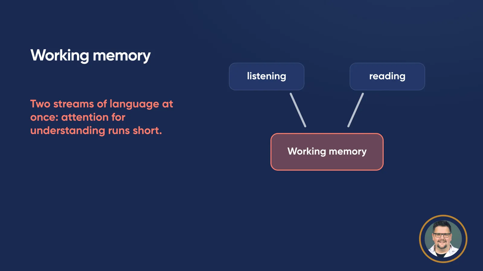
Listening and reading at the same time sends two streams of language through the same narrow working memory.
If you listen and read a full slide at the same time, you push two streams of language through it. Mayer and Moreno described in 2003 how exactly this duplication creates an additional, unnecessary load. That costs attention, which is then missing for understanding.
Redundancy and coherence
In 2017, Richard Mayer translated the research into design guidelines for e-learning. Two of them apply directly to slides:
- Redundancy principle: people learn better from pictures and spoken words than from pictures, spoken words and the same text on screen. Mayer puts it as a rule: do not add on-screen text to narrated graphics.
- Coherence principle: anything that doesn’t serve the learning goal distracts. So leave out extraneous material.
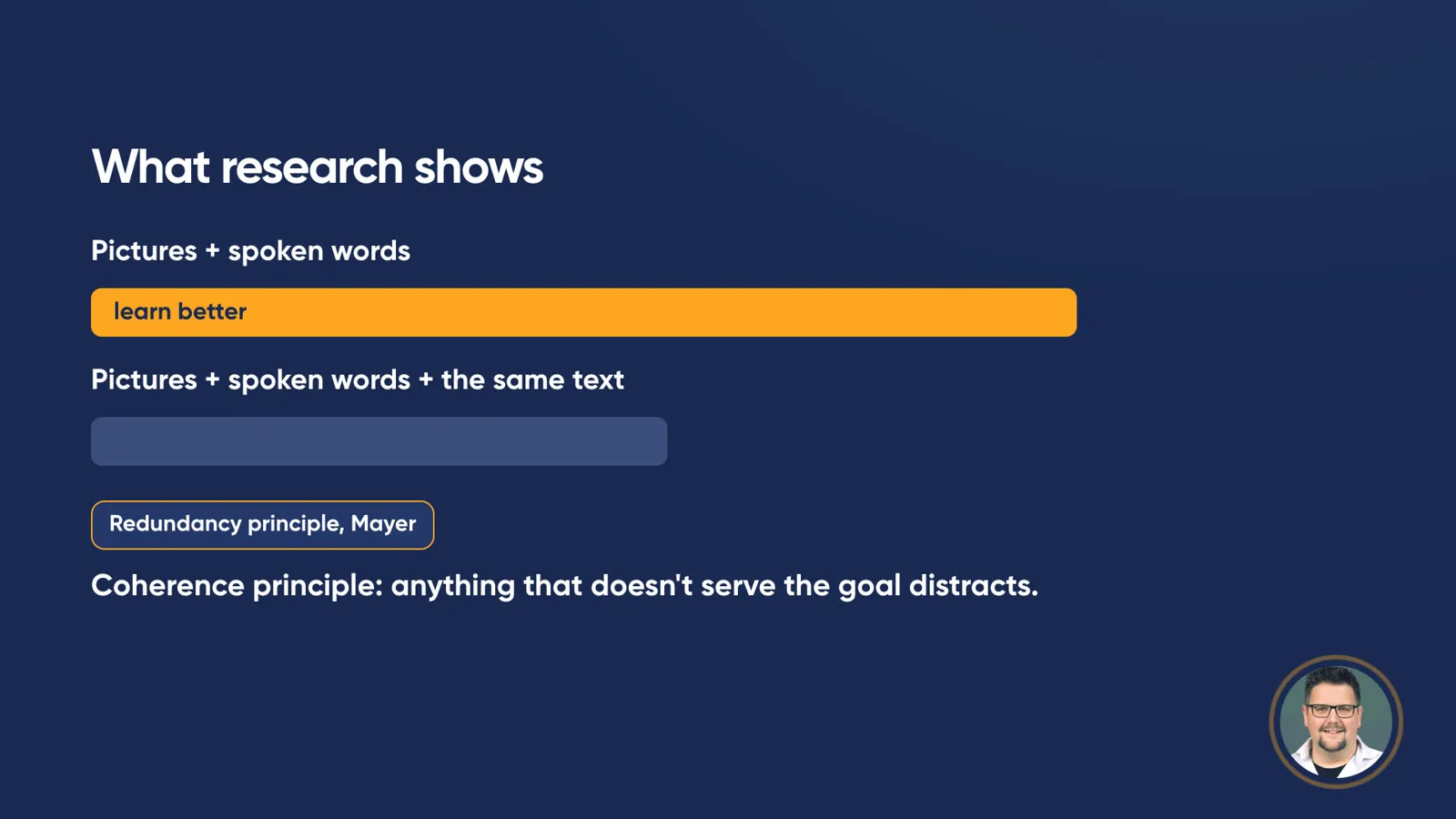
Redundancy and coherence principles: the same text on top of the voice does not help learning.
This doesn’t mean text on slides is forbidden. It means that text which only repeats what you are saying anyway doesn’t help. It gets in the way.
What about the subtitles in this video?
Fair question, since the nuggets also show text alongside the voice. The redundancy principle refers to learning situations with sound, such as slides being read aloud. I still chose to use subtitles: they make a short video understandable without sound, and they help when watching in a foreign language and for people with hearing impairments.
Three things for your next presentation
- One message per slide, as a short sentence.
- A picture or diagram instead of bullet points.
- What you say doesn’t need to be on the slide. The details belong in the handout.
My exercise for you
A suggestion you can try in half an hour: take your last presentation and find the fullest slide. Count the words. Then write the one message that should stick as a single sentence on a new slide. Think of a picture or diagram that shows this message. Everything else goes into your speaker notes or the handout.

Less text on the slide leaves more capacity for understanding.
The next time you give the talk, pay attention to where your audience is looking: at you or at the screen.
Less text doesn’t mean less content, it means more room to think.
Frequently asked questions
How much text should go on a slide?
The post suggests one message per slide as a short sentence, and a picture or diagram instead of bullet points. What you say doesn't need to be on the slide; the details belong in the handout.
What is the redundancy principle?
A design guideline by Richard Mayer: people learn better from pictures and spoken words than from pictures, spoken words and the same text on screen.
What is cognitive load?
Cognitive load theory goes back to John Sweller: our working memory is tightly limited. Listening while reading a full slide pushes two streams of language through it, and Mayer and Moreno (2003) describe how this duplication creates an additional, unnecessary load.